When writing blog posts or copy content for websites, the rules of engagement are quite often very different to those for print or other media.
Due to the electronic and visual nature of how web content is delivered, there are certain factors regarding web writing and formatting which make it unique amongst the other mediums.
For instance things like the screen size and resolution can differ greatly for people reading the exact same content, especially now that there are so many smart devices and tablets.
Also there has never been a phenomenon like the Internet which is able to provide on-demand content anytime of the day to virtually anyone.
Therefore if you’d like to increase your chances of converting or achieving your intended goal, your site’s content needs to hold people’s attention and deliver your message in an efficient and effective way.
The highest conversion rates often come from content which is easily readable & digestible
The way you format and write your copy or blog articles can have a tremendous impact on how your readers react to what they’re reading.
Studies about human online reading patterns reveal that most people don’t read every word on a web page – but instead they scan the page in an “F†pattern.
Therefore, copy content that is easily scanned by the human eye is much more likely to efficiently get the point across and is less tiresome to read.
When your readers can find what they’re looking for more easily they will also most probably click the appropriate call-to-action such as signing up to your mailing list or perhaps purchasing your product.
Below are some handy formatting tips you can apply to the pages on your site which will help to make your content easier to read and yield better conversions:
1) Write shorter chunks of copy or content of no more than about 4 or 5 lines at a time.
There are no strict rules on the Internet when it comes to paragraphs so feel free to separate long sentences if you find they take up many lines.
Splitting up your writing like this will increase scan-ability and decrease the chances of your message being lost somewhere in a sea of words. A good practice is to group sentences into chunks of no more than 4 or 5 lines.
Note: Even though there are many orthodox literary conventions that you can afford to break on the Internet, there is one which you should not violate – and that is, always ensure you have the proper spelling.
2) Use a larger and easily readable font
Typography is quickly becoming a valuable skill for Internet marketers and bloggers because using an optimum font and line spacing can be one of the key things which determine how long readers stay on your site.
This is because the more easily and less wearisome your site is to read, the better the experience your visitors will have. Therefore it is a good idea to use a large an easy-to-read font if possible.
3) Use grouping & visuals to organize content
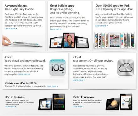
Grouping is where you clearly segment sections of your content using columns and concise headings and messages, together with some visuals such as icons or images.
This type of delivery makes it very reader-friendly and allows your visitors to access the information they need without having to scour your site for it.
The example below represents a perfect case of grouping used by Apple on their iPad page. As a matter of fact you’ll notice that the Apple site contains many examples of grouping in action.

A lot of WordPress themes now give you the ability to create columns and tables which can help you achieve the above format.
4) Use numerals, ampersands & other symbols to shorten headings (or sub-headings)
This is a simple yet effective way to deliver your message concisely. For instance take the following example:
Without using symbols and abbreviation:
“Earn hundreds of points and get exclusive access to our member specialsâ€
With symbols and abbreviations:
“Earn 100s of points & get exclusive access to our member specialsâ€
5) Use bolding to highlight what you want your readers to see
The simple act of making a word or words bold can make a message stand out. As long as you don’t overdo it this is a great way to facilitate easy scanning of your pages.
6) Use bullet lists of no more than 5 or 6 items
- Bullet lists are great for breaking the monotony of reams of text and a handy way to link related points together.
- A bullet list should be no more than 5 or so items so as to ensure that your readers are not overwhelmed with content.
- You don’t have to use bullets or dots. Icons and other images are sometimes the most effective if you can keep them relevant to your message.
- Your second-best bullet point should be placed last so that someone scanning your list will be surprised and impressed to read it because people usually expect the least useful point to be the last!
7) Use icons and images to enhance your message delivery
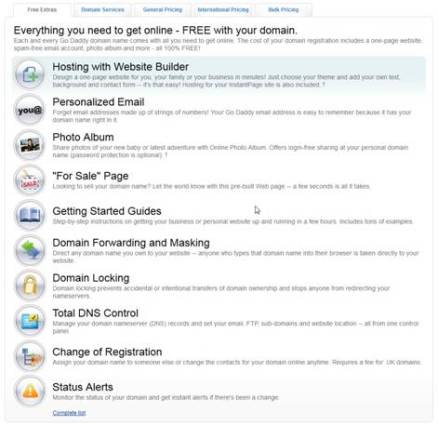
The placement of relevant images or icons around copy text can serve a useful purpose of drawing your readers eyes to your message. The key is not to overdo it.
Below is an example of how GoDaddy utilizes icons to get their messages across:

8 ) Ensure your text links are easily recognizable
When you place a link on your page, you usually do so because you want your readers to click it. Therefore, if a piece of text looks like a link then people will more than likely click it.
Most WordPress themes already have an inbuilt ability to colorize and/or underline text links. Sometimes you can add your own touch by crafting your links to look the way you would like them to.
For instance I once saw a successful affiliate site which had its text links formatted as follows:
<== Click Here To See Today’s Specials ==>
The above simple technique is quite effective but might not be for everyone. The point is that you are not limited in how you highlight your text links – as long as you do somehow.
In summary, the above tips are just a hand-full of the things you can do to optimize the readability and convert-ability of your web pages.
The Internet is an amazing communication medium unlike any other in our history but it also contains many distractions which you will have to compete against to win your readers’ attention.
I hope the above tips will at least give you something to help keep your visitors long enough to get your message across.
Most people hate reading long paragraph. I hate it too!
So numbering and bullets are the best way to go!
Easily readable and digestible sometimes doesn’t have anything to do with just the length of the article. I have seen super long sales pages that are easily readable and digestible. I guess it depends on your niche but I personally don’t focus too much on the number of words. I like to fully explain the topic as much as I can and if it gets a bit long then so be it.
This is an awesome listing! Something a bit “iffy” though is this statement: “The highest conversion rates often come from content which is easily readable & digestible.” While I agree (or used to?), I’ve had many complaints from readers about not making articles long enough.
What would you say is a good average size? I’ve been floating around 400 words or so on average, as that seemed like a good spot to break apart articles into new ones. I just have the feeling if I was doing 800-1k word ones most people would just say “whoa, too long” and turn away.
Hi.
Using icons, visual representations, good formating and so on, are really great tips. I found interesting the thing you said about only 5-6 bullets, I haven’t thought about that.
I think that another really good advice is to show little amount of information overall on the page. No matter how we format it, when people scan, they see huge amount of stuff on the page and are scared. We should use the rules: less is more and keep it simple. Showing only the vital information with links like Read more that reveal with jQuery or JS more info is a very good approach.
Regards.
Haven’t given much thought to creating columns and tables in my blog. Like that idea….thanks for the tip.
I’m going to use this tips in my new wordpress blog design. thanks for great information
Maybe i am a fool, but i tried to click on the (fake) link that you made for getting attention. does it to me.
Its really a very good idea to get more attention on a link in a site.
Some people will say its not so good if you use it oft, but whats the best? i dont know, but for me, i need the click of the viewer and so i will try to use this format. I made just 5 little webprojects for now, but thanks to you i am still learning more and more. maybe some “webmasterpros” are laughing, but for me and other beginners in the web, an article like this is really worthful and now i will bookmark your site and read more.
my favorite principle. Great article on fundamentals, thanks!
It really all boils down to the KISS principle. Keep It Simple Stupid.
Good article
Hi, Thank you for a nice informative article on copy-writing. Keeping these points in mind when creating a sales page will definitely help making an optimized sales page that converts well.