So far this year, statistics show eCommerce sales account for 653 Billion US dollars worldwide. While many entrepreneurs are attempting to sell a product or service online, only a small percentage of these sites are successful.
Your product pages will either encourage or discourage buyers from clicking on the payment button. While a fancy shop page may be visually appealing, it goes far beyond this. Creating a shop page that is informative, precise and neatly laid out can help to turn your browsers into buyers.
Whether you have already set up an eCommerce site or are thinking of doing so in the near future, this article will address a number of ways you can improve your product pages and in turn, increase your revenue.
What is the Overall Aim of a Product Page?
Before we delve deep into fixing up our product pages in a mission to increase sales, it is important to firstly identify what a product page is; and what it should include.
In simple terms, a product page is where a customer can go to read details about a product. Product pages generally include a call to action button that the visitor can click to purchase the item or service. While anyone can create a basic product page, a ‘great’ product page includes some key differences.
A ‘great’ product page incorporates the following:
- Detailed information about the product including high quality images and videosÂ
- Details about the brand
- Assurance that the product will work out for the buyer
Feeling Disheartened about Your eCommerce Site? Persistence and Patience is Key
Before you read on further, it is important to understand that persistence and patience is key. Becoming rich over night from an eCommerce website is as rare as winning the lottery. Those who run successful websites generally have invested many hours in doing so.
Did You Know?Â
- Only 22% of online business owners are satisfied with their conversion rates.
- Using videos on your website landing pages can increase sales by 80%
- Personalized call to action buttons convert 42% more visitors
Tips & Tricks to Creating Successful Product Pages
You have a decent amount of traffic coming to your website although your visitors are not transitioning into customers. Below we’ve identified some tips and tricks that many successful eCommerce sites implement to increase their conversion rates.
The ultimate goal when creating a product page should be to inform and entice your visitors to click the payment button. While there is some method to creating a highly converting product page, the ingredients will differ depending on your specific site and the product or service you are offering.
#1 Clear Call to Action Buttons – Visibility and Consistency
When speaking about a product call to action button two words should come to mind. Visibility and consistency.
Ensure your buttons are visible to those young and old. Be consistent across the entirety of your website. Choose a button style and color and stick to this across your entire site.
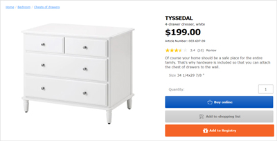
Without a call to action button, the customer has no way of easily purchasing the item. The call to action button, whether it be an ‘Add to Cart’ or ‘Buy Now’ button should be the most important component of your product page.
Positioning your CTA button center stage in an uncluttered position will ensure no visitors with the intention to purchase will miss it. The color and size of your button is also important. Choose a color that suits your website although something that will stand out from the background.
Keeping your CTA simple and neat is always the best technique. Someone who is genuinely interested in buying your item will be looking for a simple ‘Buy Now’ or ‘Add to Cart’ button.
#2 Product Page Address & Speed
If you are asking for your customers to supply you with credit card payment details you should always have an SSL certificate. Ensuring the safety of your customers payment details should be prominent. When talking in terms of an eCommerce site, HTTPS should never be negotiable.
Pages that are slow to load can also turn away potential customers. Lagging pages are one of the biggest conversion killers in the eCommerce world. Ensure you have dedicated hosting if you intend on exponentially growing your business.

#3 Quality Images and Videos
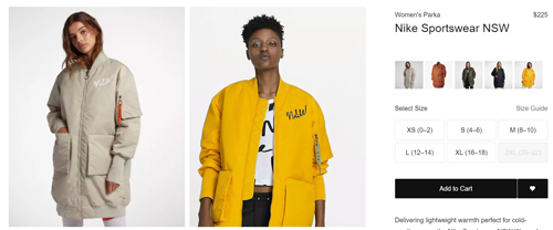
No matter what product or service you are offering, ensure any photos that you include are of high quality. The photos give buyers and idea of the item that they are paying for and often what they can expect to look like when using or wearing the item. High quality photos that display every aspect of the item will give your customers the confidence they need to click the ‘CTA’ button.
If you have multiple photos of your product on hand, why not include them all? The more angles of the item. The better. Including a zoom option allows your customers to view the image closer to see the details of the item.
While adding videos does not make sense for all products and services, including one video for a product it makes sense for can increase conversion. A handful of the top fashion stores display videos of models wearing their items. Including a 360 degree view of the product gives the customer the best possible demonstration of the item they will be purchasing.
- High quality images – no fuzzy business
- Ensure all images are of the same or similar sizes
- 360 degree views of your product can help to increase sales
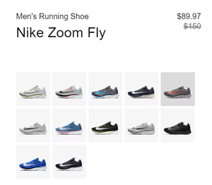
- Supply an image of each variation available (where it makes sense)
- Enable zoom-able images where possible
- Provide your customers with context for example, a model wearing the clothes you have for sale
#4 Easy Navigation
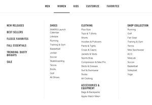
Visiting your website as a buyer can help you see where they may become frustrated or confused. Critic how easy it was to find the product that you are looking for. Did you need to click just a couple of buttons? Or was it a tedious process.
Having your product pages neatly organised into categories and sub categories can allow your customers to find what they are looking for quickly and easily. If your customer cannot easily locate the product they are looking for it can deter them from continuing to visit your website.
#5 Product Name & Price
While the name of your product generally does not encourage or deter a shopper to proceed to checkout, a catchy name is more likely to be remembered.
The price of your product as well as the call to action button; a ‘buy now’ or ‘add to cart’ button should both stand out from the rest of the product page. Choosing a stand out color for your buy now button can draw your customers in. The price should be written in one of the largest fonts found on the page. Placing the price right by your call-to-action button makes sense.
Many business owners use the left-digit effect where an item can be only 1 cent less although the entire price appears cheaper to the buyer. A product advertised for $29.99 appeals to customers compared to a product listed for $30.00 while there is only 1 cent difference between the two.
If you are offering a discounted price make sure this is pointed out to your customers such as the previous price crossed out beside the current price. This way your customers are visually displayed the discount they are receiving and who doesn’t love a sale!
#6 Description
The description you give of your product can often make the final decision (along with the price) for a browser to click the payment button or to leave the site. This is where you as a business owner have the opportunity to ‘sell’ your item to potential customers. Including descriptive language can help a customer envision how your product will positively impact their life.
While copying a stock description may seem like the easy way out, this gives you little SEO benefit. Adding your own personal touches can go a far way.
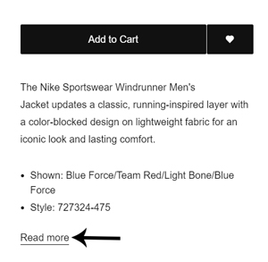
Many companies choose to bullet point their description so that their visitors can scan the information and digest it easily. Another great way to keep the description concise is by adding a ‘read more’ button for those that wish to read the full description. While some visitors are happy with the basics, other visitors like to know the nitty-gritty prior to checking out.
In the description of any product it is important to ask yourself what you as a customer would want to know about the product or service. Answering some of the following questions within the description of your product can increase the liklihood of a browser turning into a buyer:
- What material is the item made of?
- Where was the item made?
- How was the item made?
- What can the item be used for?
- How is the item packaged?
- Is there a shelf-life for the item?
- What care instructions should be included?
- Does the item come with a warranty or money back guarantee?
- Can the buyer return the item?
#7 Variations
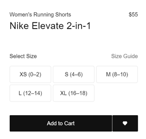
If there are a number of variations your customer can choose from such as color and size, make the process as simple as possible. Drop down menus often work well for product variations. Other online stores graphically present product variations so that buyers can simply decide which style they like better.
Where possible, ensure you are offering variations for your products. While keeping a product simple can work for some sites, having the options there will never loose you a sale.
#8 Related Products
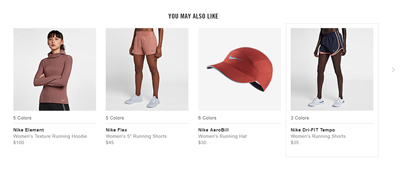
Adding related products towards the bottom of the page exposes buyers to other products that they might be interested in. For example, your customers may be viewing a t-shirt. A related product may be a pair of jeans that you are selling.
Displaying related products can be shown on the product page or after the customer clicks the CTA button. If one product isn’t perfect for your customer you’d hope another relative product will be a better fit.
#9 Offer Reassurance
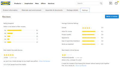
Did you know that 85% of your customers will read reviews prior to making a purchase?
Unless you are a global brand, customers may be skeptical when making their first purchase. Integrating your social media accounts allows your customers to view what others are thinking about your product or service. Adding a comments area to each of your product pages also allows previous customers to speak what they thought about the product and delivery. If you are providing a good quality item with prompt shipping you are likely to receive good feedback.
Including your returns policy can also give your customers reassurance. Knowing that a return is an option can give your customers confidence.
When answering negative reviews always be professional and apologetic. Leaving any negative reviews unanswered can turn future customers away.
#10 Sprinkle a Sense of Urgency
I use the word sprinkle because adding too much ‘urgency’ to your product can actual turn customers running. Including a sense of urgency such as crossing out variations that have sold out, or mentioning if a product has recently sold close buy can encourage the customer to take the next step and checkout.
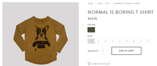
Product Page Checklist
Being honest about the product you are selling is always important. This way your customers are not left disappointed. Ensure that you have answered any questions your customers may have about your item somewhere on the product page.
- Product Price (Including Shipping and Tax Costs)
- Product & Variations
- A Call to Action Button (add to wishlist, add to cart or buy now)
- A Description
- Product Images and Videos
- Product Page Address (HTTPS)
- Navigation Menu
- Related Products
- Sprinkle a Sense of Urgency
- Reassurance Through Reviews
- Estimated Shipping Date
- Information Regarding Returns Policy / Warranty
‘Great’ Product Pages
Implementing the tips and tricks above on your own site will help to turn your browsers to buyers. Depending on your website, some tips may help with conversion more than others.
Visit your product pages as if you were a customer. Ask yourself if anything is missing or unclear. Removing any doubts surrounding the product or service ensures there is nothing holding the potential customer from clicking the payment button.
If you have any other suggestions that you think we’ve missed in relation to improving product pages to increase sales please let us know in the comments section below.
All the best with your eCommerce website. If you are setting up a WordPress site, take a look at our eCommerce solutions here.
Leave a Reply