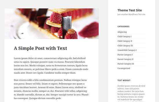
I don’t like the left hand sidebar for the new WordPress Twenty Fifteen (2015) theme. So I created a child theme that moves the sidebar to the right hand side (everything else is the same).

Twenty Fifteen Child Theme Features
This is a 2015 child theme so you get all the standard features of the main twenty fifteen theme.
It is clean, blog-focused, and designed for clarity. Twenty Fifteen’s simple, straightforward typography is readable on a wide variety of screen sizes, and suitable for multiple languages.
Download the 2015 Child Theme Right Sidebar
Download the theme.
How to Install the Theme
- Log in to your WordPress dashboard and go to Appearance menu, Themes sub-menu.
- Click Install Themes tab and select Upload option.
- Upload the zip file (2015-child-right-sidebar.zip) and activate the theme.
Check out our WordPress development page for more cool WordPress resources.
@Gisela, Yes I would like to take a look at your tweaks. You can reply here and share your changes.
Hello! I love Twenty Fifteen and it was really great to know someone made a child theme for right sidebar. Thank you!
When I tried it, I found a little issue with its responsiveness (which I fixed by myself) and some of the media queries codes are redundant. I would love to talk about it if you are willing to. It is a really simple issue but I think it will make your codes even more awesome!
Thanks again!
@Daniel, we have updated the theme to use the enqueue function.
I notice the style sheet uses the @import url for importing the parent style sheet. This is no longer best practice. See: http://codex.wordpress.org/Child_Themes.
It is now enqueued from the child theme functions.php file.
@Nils, Thats how the sidebard of the 2015 theme works. Once you scroll down and go past the content of the sidebar, it will show the background only (because your sidebar content is at the top).
Hello guys,
I recently went over to use your theme for our blog. I appreciate it very much, thank you for that.
I got one problem with it though: The Sidebar does not stay in the visible area when scrolling but sticks to the content which makes it invisible pretty much instantly. I can´t find the difference to 2015 causing this “issue” (maybe its planned, dunno). Can you help me out?
Thanks Guys!
Looks great but I prefer the center aligned site title/logo style as it was in other wordpress versions.
Thanks a bunch for this. I haven’t installed it yet, but it looks like it will be one of the fixes I’m looking for.
I also want to turn off hyphenation in TwentyFifteen. To my eye, hyphenation is a throwback to the days of the Linotype when newspapers wanted to save a small percentage of space on the paper. That is not a concern on the web. Further, the hyphenation in TwentyFifteen is often wrong — as in hyphenating the surname Beggs as Beg-gs.
Another nitpick: I use many horizontal rules , for example to break an introduction to longer text. For some reason, TwentyFifteen uses such a light shade of gray on horizontal rules that it nearly invisible.
But, I do like much of TwentyFifteen. On several websites, I post a lot of long form articles and essays.
Right sidebar is great .I will use Twenty Fifteen for my new webs .Thanks for share ! 🙂
@Damien, You should probably create a page tamplate that doesn’t have any sidebar. Then on the pages where you don’t want any sidebar, you can use that template. Check the following tutorial which tells you how to create WordPress page templates:
https://www.tipsandtricks-hq.com/how-to-create-and-use-custom-page-template-in-wordpress-to-create-a-sales-page-2095
Hi there, thanks for the child-theme.
I’m pulling my hair off to create a page model with NO sidebar at all, so I may choose which page will have the sidebar and which won’t have it.
Can you please help with that or, if you wish, provide a model with no sidebar?
You’d make my day! 🙂
Thanks.